Your cart is empty :(
0
0
Published: 18.05.2026
11 min. read
How Textile Colors Affect Mood and Visually Expand a Room
How Textile Colors Affect Mood and Visually Expand a Room
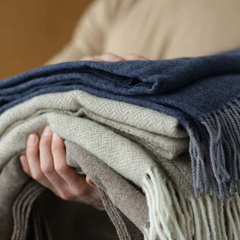
Home textiles are no longer just practical interior details. Today, blankets, throws, decorative pillows, and other textile elements shape the atmosphere of a space, influence mood, and even affect the feeling of comfort. The color of textiles often sets the emotional tone of a room and helps create a harmonious interior.
Properly chosen shades can make a space feel warmer, brighter, or cozier. Poor color combinations, on the other hand, can overload the interior and create discomfort. That is why color psychology in interior design has become an important part of modern decorating.
Color Psychology in Interior Design and Its Influence on Emotions
Color constantly and subtly affects the way we perceive a room: it creates the first impression, sets the emotional tone, and influences how we relax or work. While changing walls or flooring is difficult, textiles such as blankets, bedspreads, and pillows are the easiest way to control color in a space. Simply replacing a throw blanket can completely transform the atmosphere of a room.
It is important to understand that the effect of textile color on mood depends not only on the shade itself, but also on its saturation and brightness. Pastel blue and electric blue are technically the same color, yet they create entirely different moods in an interior.
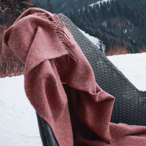
Warm Shades for Coziness and a Homely Atmosphere
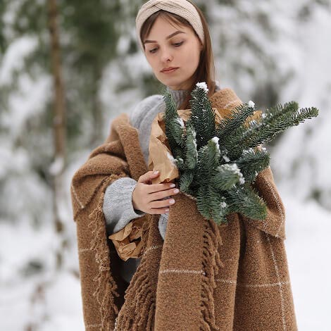
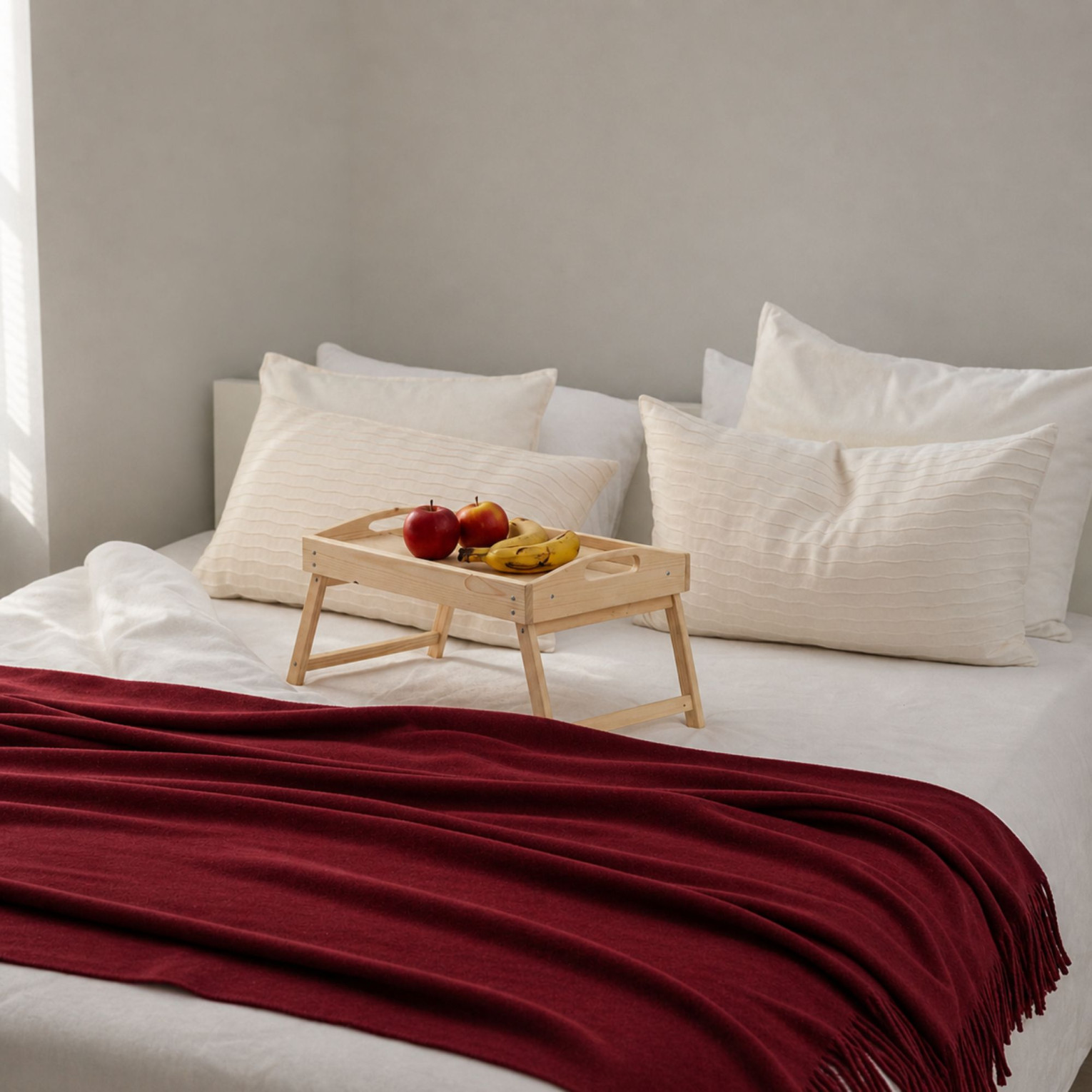
Warm color palettes are traditionally associated with comfort. Shades of cinnamon, caramel, terracotta, and warm beige add softness and visual warmth to an interior. These colors work especially well in living rooms, where creating a relaxing and welcoming atmosphere is important.
A terracotta or mustard-colored throw blanket on a living room sofa is one of the easiest ways to add coziness and personality to a room without any renovation.
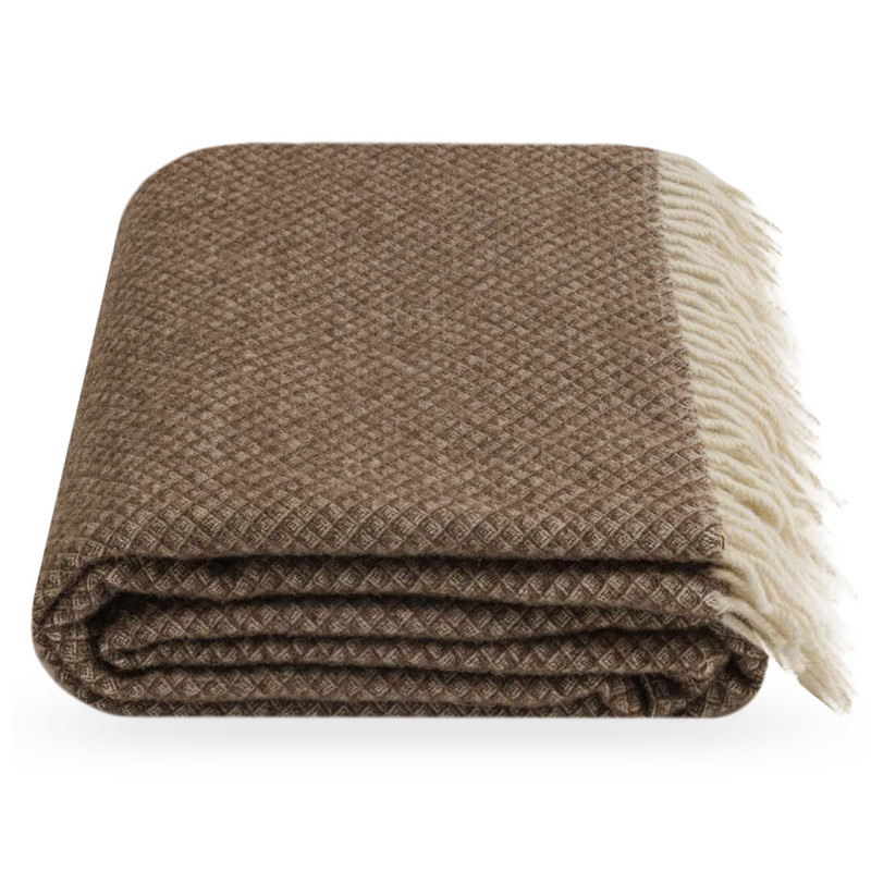
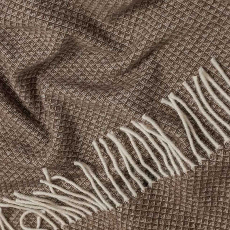
The Bouclé Premium blanket in mustard or dark red, the Ruta blanket in mustard, burgundy, or red, and the Grand blanket in mustard or deep red each create a warm accent and instantly change the mood of the room. For a more subtle warmth, the Scarlet blanket in beige or the Polo blanket in brown provide comfort without excessive brightness.
Mustard deserves special attention. This shade is one of the most successful colors for creating coziness in autumn and winter décor. It is softer than bright yellow while still feeling warm and sunny.
Light Colors for Calmness and Visual Lightness
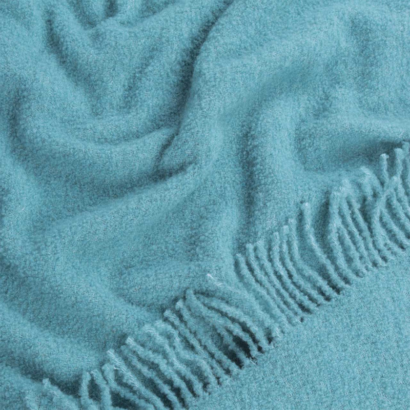
Light and cool shades affect the nervous system in the opposite way: they calm, reduce anxiety, and encourage relaxation. Blue, sky blue, lavender, and light green have all been proven to lower heart rate and support melatonin production, making them ideal for bedrooms.
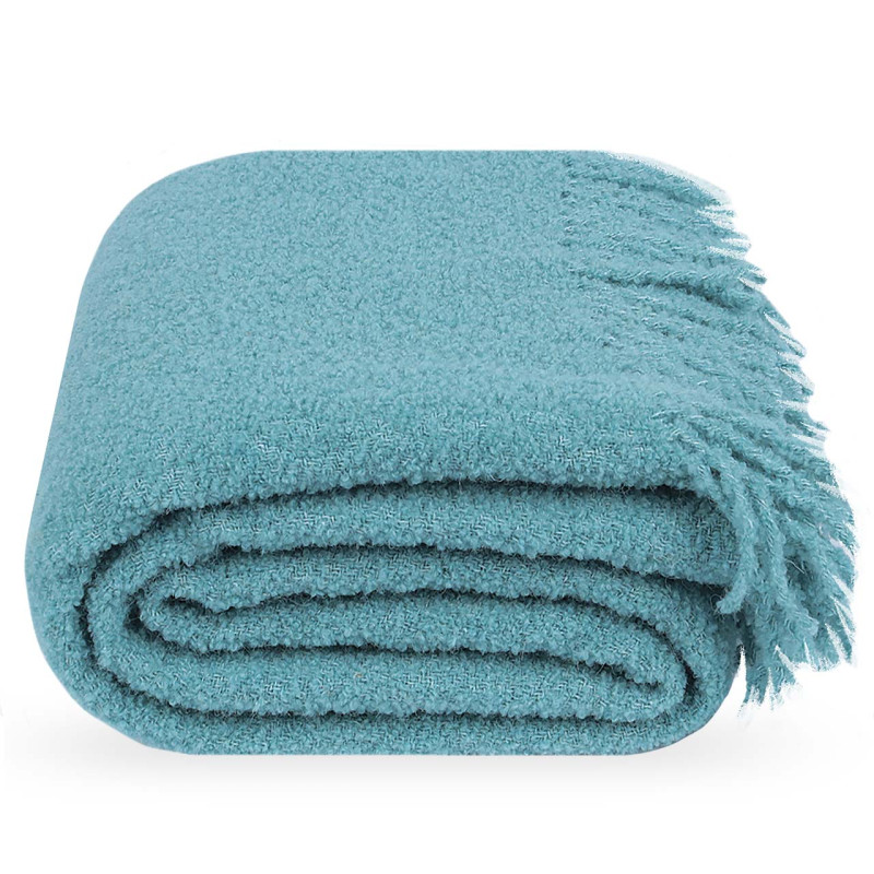
The Alaska mohair blanket in pistachio or blue, the Leon blanket in mint, light blue, or pistachio, and the Bouclé Lounge blanket in sky blue or light turquoise create a feeling of lightness and tranquility in the bedroom. Such décor is especially suitable for people who find it difficult to switch from work mode to rest.
White and ivory belong to a separate category. The Bouclé Premium blanket in white or ivory, the Leon blanket in white, and the Symphony blanket in ivory are examples of textiles associated with cleanliness, spaciousness, and freshness. Ivory and creamy shades add warmth while removing the sterile coldness often associated with pure white.
Natural Colors as a Modern Interior Trend
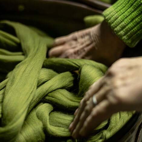
Modern interiors are increasingly drawn to natural color palettes. Shades inspired by linen, wood, sand, olive, and greige look stylish, sophisticated, and calming at the same time. The popularity of such solutions is connected to the growing interest in eco-aesthetics and natural materials.
Natural colors are universal and harmonize with any style — from minimalism to boho, from classic interiors to loft aesthetics. A cotton or cashmere bedspread in sandy or caramel tones placed on a living room sofa perfectly reflects the modern idea of home comfort.
The Lanavitta collection offers a wide range of natural shades. The Maris throw in beige, the Polo throw in beige or brown, and the Lux blanket in beige or lontra are elegant cashmere options for those seeking sophistication. For lovers of true naturalness, the eco-collection made from undyed Mongolian wool — including the Rendezvous, Comfort, and Legend blankets in natural beige and brown — creates the most organic atmosphere possible.
The Montre throw, combining beige with dark gray or light beige with burgundy stripes, is a textured option that becomes an accent without excessive brightness while still remaining within a natural color palette.
How to Visually Expand a Room with Textile Colors
Textile colors influence not only mood but also the perception of space. With the right shades, a room can appear brighter, larger, and more harmonious.
Light Textiles Make a Room Feel Larger
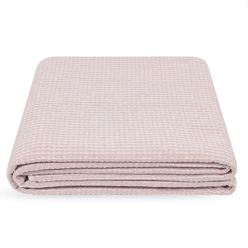
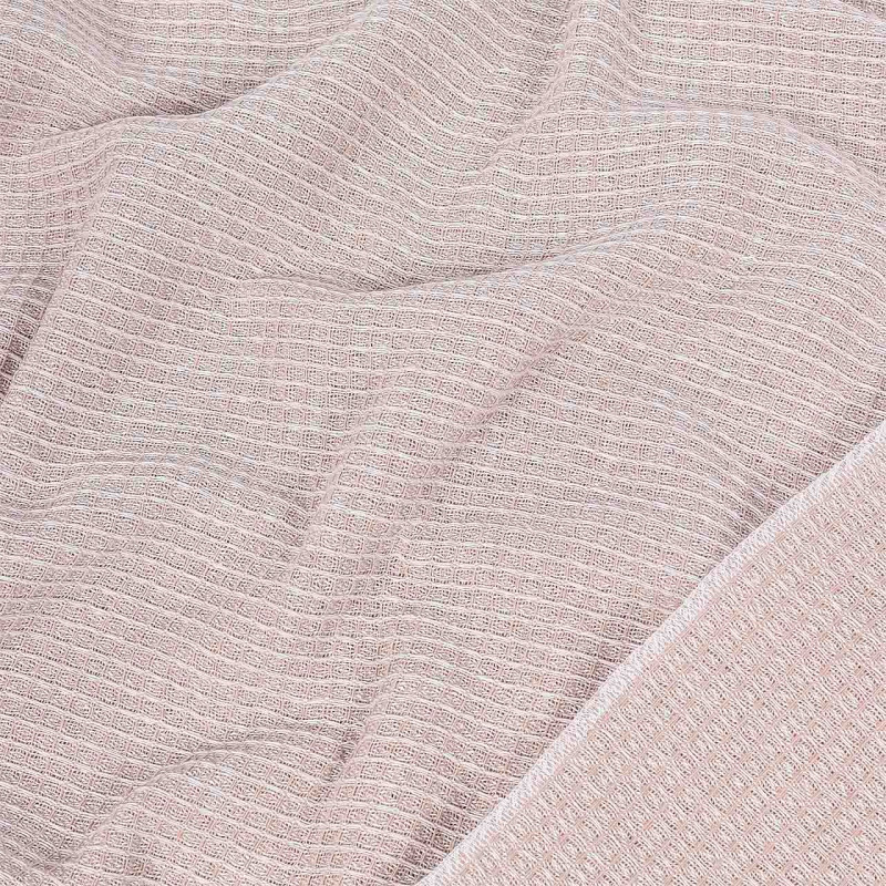
The rule is simple and reliable: the lighter and more neutral the textiles, the larger the room appears. White, cream, pastel, and pale gray bedspreads visually “dissolve” into the space, making furniture appear lighter and less bulky.
If a room is small, choose blankets and bedspreads that match the walls or are one or two shades lighter — and the space will instantly feel bigger. The Bouclé Premium blanket in white or ivory, the Scarlet blanket in light beige, or the Alaska blanket in ivory combined with light flooring and minimalist décor perfectly demonstrate how to visually enlarge a room without renovation.
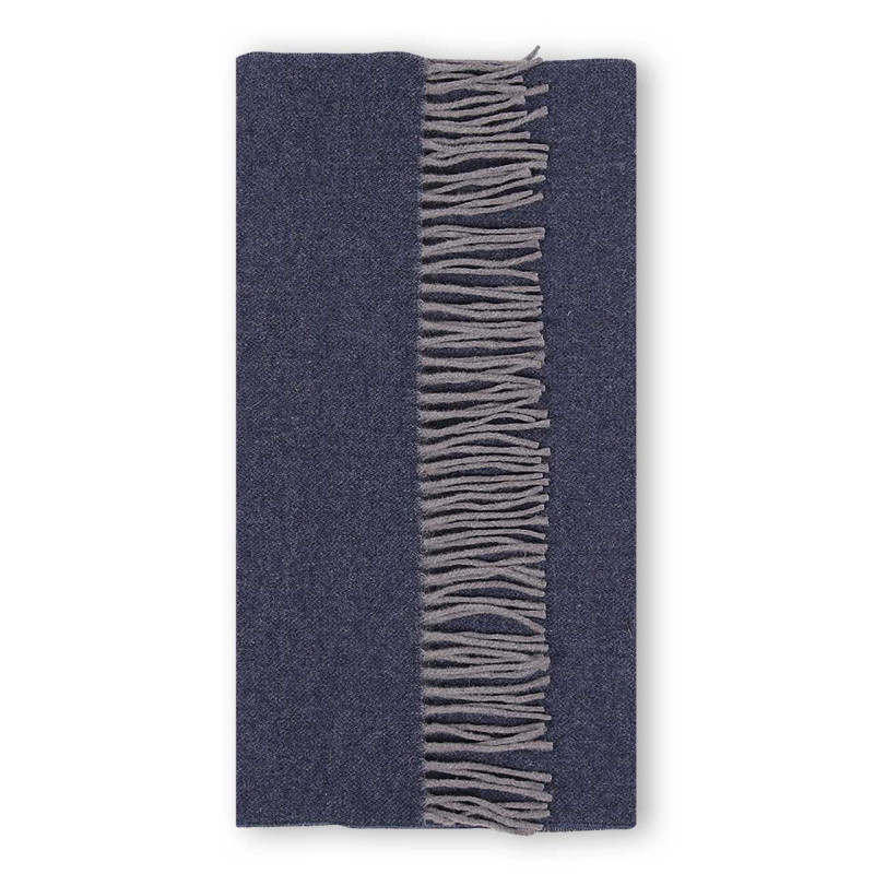
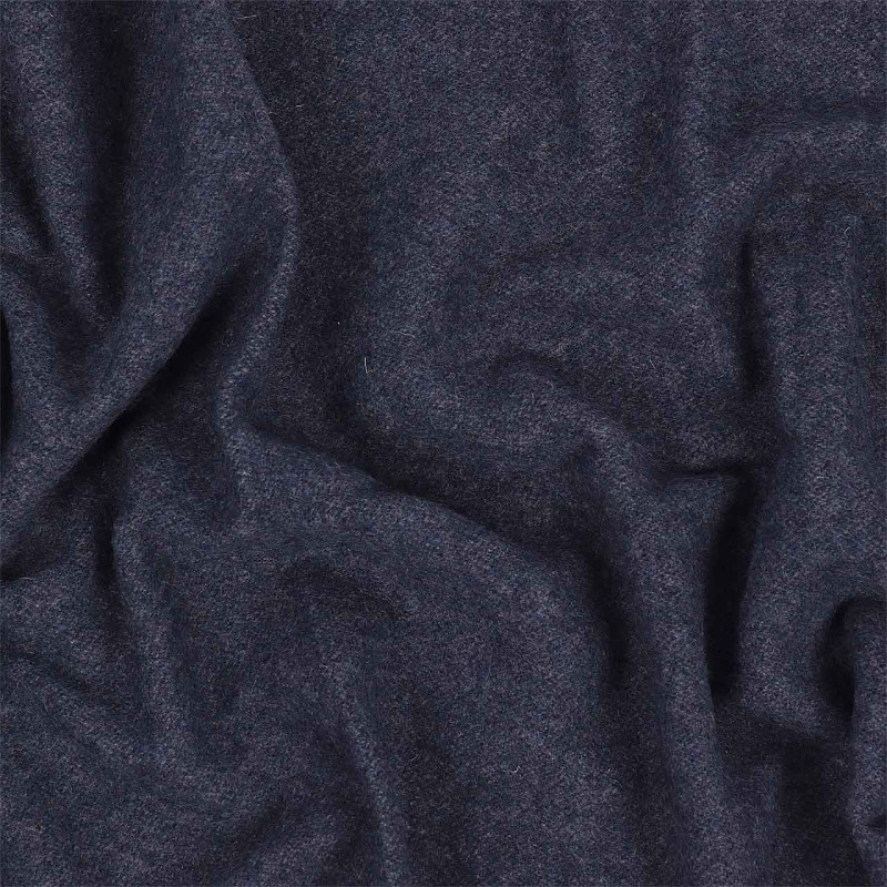
Dark Textiles Add Depth and Intimacy
Dark shades create depth and character, but in small rooms they should be used carefully. Graphite, dark blue, or chocolate tones can make a room feel more intimate and cozy.
Dark textiles work best as accents, especially when combined with light furniture or neutral walls. A black Maris blanket on a sofa can visually define the seating area and create a stronger focal point.
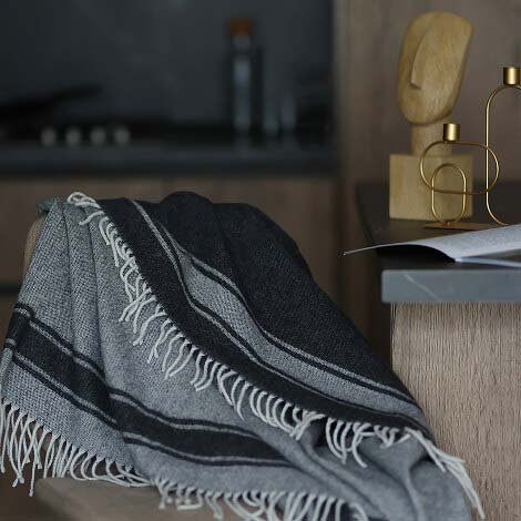
Patterns and Stripes Influence Proportions
Patterns also affect how we perceive a room. Horizontal lines visually widen a space, while vertical lines make ceilings appear taller. That is why textiles with geometric patterns or subtle stripes can not only decorate a room but also help correct its proportions.
This technique is especially useful in rooms with unusual layouts, such as low ceilings or narrow spaces. A carefully chosen textile pattern can visually improve proportions without changing the architecture.
The Montre striped blanket in beige and dark gray is a restrained yet expressive example of how patterns can work with room proportions.
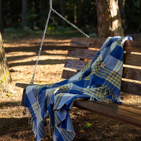
Solid Colors vs Prints for Small Spaces
For small rooms, solid-colored bedspreads and blankets in neutral or pastel shades are the safest option within minimalist aesthetics. They do not overload the space visually and allow the room to “breathe.” Prints are better suited for larger spaces or used sparingly — for example, as an accent pillow against a neutral background.
Cozy Color Combinations: How to Match Textiles in One Room
Harmonious color combinations make an interior feel complete and comfortable. Textiles often connect all elements of a room into a single composition:
The Rule of Three Colors.
A classic interior design principle involves using one primary color (60% of the space), one secondary color (30%), and one accent color (10%). For example: beige walls, a gray natural cotton bedspread, and a mustard-colored pillow as an accent. Simple, balanced, and timeless.
Monochromatic Palette.
Using different shades of the same color is a safe and modern approach in minimalist interiors. A warm milk-colored bedspread, cream pillows, and a soft white wool blanket create depth not through contrast, but through the combination of textures: smooth cotton, soft cashmere, and structured linen.
Contrasting Color Combinations.
For those who prefer expressive interiors with personality, contrasting pairs such as blue and orange, green and terracotta, or gray and mustard create dynamic and lively spaces. The key rule is that one of the colors should remain neutral or muted so the contrast feels intentional rather than chaotic.
Considering Lighting.
Lighting strongly influences how colors are perceived. In rooms with cool lighting, warm textile shades help create a cozier atmosphere. In bright sunny spaces, light and cool shades look especially harmonious.
That is why, before choosing a blanket or bedspread, it is important to evaluate both natural and artificial lighting so the textiles look as comfortable and natural as possible.
Color is the easiest and most accessible way to transform the atmosphere of a room. And textiles offer the greatest freedom for experimentation: today a pastel cotton bedspread for lightness, tomorrow a deep emerald throw blanket for a completely new mood. In the Lanavitta collection, you will find bedspreads and blankets in a wide range of shades — from classic neutrals to bold accent colors — so every room reflects your personal style and comfort.
Your rating of the article
Terrible
Bad
So-so
Good
Everything is great!
Scroll down, subscribe ;)
Instagram: @lanavitta.wool